
- Short Sleeve Collar Polo Tshirt
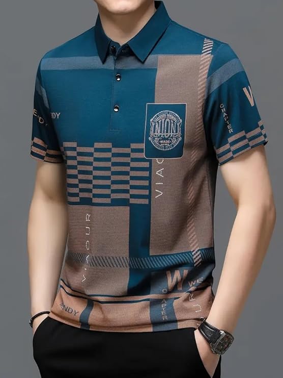
Men’s Irregular Geometric Pattern and Alphabet Print Sports Collar Tshirt (Rizim Temu Print Polo-Blue)
Original price was: ₹1,500.00.₹500.00Current price is: ₹500.00.
Description
The Ultimate Guide to Alphabet Print Tshirts: Typography, Street Style, and Personal Expression
Introduction: The Power of the Printed Word in Fashion
In the ever-evolving lexicon of men’s fashion, where visuals often dominate, a powerful trend speaks a different language: the language of letters. The rise of the alphabet print tshirt represents a fascinating fusion of typography, personal expression, and urban style. This garment is more than just a piece of clothing; it is a wearable manifesto, a billboard for personality, and a canvas where language meets design.
The search for the perfect alphabet print tshirt is a pursuit of identity, a desire to communicate a message, a mood, or a membership to a particular cultural sphere without saying a word. It is an item that speaks to a man who is culturally literate, style-conscious, and unafraid to use his clothing as a medium for statement and storytelling.
This definitive guide serves as your master resource into the world of the alphabet print tshirt. We will explore the history of typography in apparel, break down the design elements that make a graphic compelling, and provide expert advice on how to style these communicative pieces. Our focus will culminate in a deep-dive analysis of a product that exemplifies this category’s hybrid potential: the
Men’s Irregular Geometric Pattern and Alphabet Print Sports Collar Tshirt. This shirt, with its layered alphabet graphics, dynamic irregular patterns, and athletic sports collar, represents a pinnacle of what a modern alphabet print tshirt can be. Throughout this exploration, we will continually return to the core principles that make a well-designed alphabet print tshirt a powerful tool in a modern style arsenal.
The journey to understanding the impact of a great alphabet print tshirt involves an appreciation for graphic design, an understanding of subcultural codes, and a recognition of how fashion can be both personal and public. It’s about finding a piece that not only showcases a unique visual aesthetic but also resonates on a deeper level, whether through a recognizable brand name, a cryptic slogan, or simply the artistic arrangement of letters themselves. The right alphabet print tshirt, like the one described, can become a signature piece that sparks conversation and defines a look.
Table of Contents
-
Chapter 1: Deconstructing the Message: The Anatomy of an Alphabet Print Tshirt
-
Typography as Design: Fonts, Kerning, and Layout
-
The Meaning Behind the Letters: Slogans, Brands, and Abstraction
-
The Sports Collar: An Athletic Frame for a Graphic Statement
-
The Geometric Overlay: Creating Visual Depth and Complexity
-
-
Chapter 2: A Brief History of Text on Textiles
-
From Band Merchandise to Luxury Logomania
-
The Punk and Hip-Hop Movements: Slogans as Rebellion
-
The Alphabet Print Tshirt in the Era of Streetwear and Social Media
-
-
Chapter 3: Why an Alphabet Print Tshirt is a Wardrobe Essential for the Modern Man
-
The Ultimate Tool for Personal Branding and Identity
-
Cultural Currency and Community Affiliation
-
A Conversation Starter and a Form of Non-Verbal Communication
-
The Versatility of a Graphic Statement Piece
-
-
Chapter 4: The Style Playbook: How to Wear an Alphabet Print Tshirt
-
Streetwear Foundation: Mastering the Urban Look
-
Casual Contrast: Letting the Graphic Be the Star
-
High-Low Fashion: Pairing with Tailored Pieces
-
Accessorizing a Text-Based Garment
-
-
Chapter 5: The Design and Print Process: Crafting the Message
-
From Concept to Vector: The Design Workflow
-
Printing Techniques for Durability: Screen Printing vs. DTG
-
Ensuring Readability and Impact in an Alphabet Print Tshirt
-
-
Chapter 6: The Art of the Fit: Silhouette for a Graphic Tee
-
The Modern Streetwear Fit: Boxy vs. Slim
-
How Fit Influences the Perception of the Graphic
-
The Sports Cut: Aligning with the Collar’s Athletic Vibe
-
-
Chapter 7: Product Spotlight: The Irregular Geometric and Alphabet Print Tshirt
-
First Look: Aesthetic Analysis of a Layered Design
-
The Alphabet Print: A Closer Look at the Typographic Element
-
The Sports Collar and Geometric Pattern: A Fusion of Styles
-
-
Chapter 8: The Target Customer: Who is This Shirt For?
-
The Streetwear Enthusiast and Hypebeast
-
The Culturally-Conscious Consumer
-
The Individualist Seeking a Unique Statement
-
-
Chapter 9: The Competitive Landscape: Market Position
-
The Saturated World of Graphic Tees
-
The Value Proposition of a Hybrid Design
-
Navigating Trends in the Alphabet Print Tshirt Niche
-
-
Chapter 10: The Customer Journey: From Discovery to Signature Style
-
The Path to Purchasing a Graphic Statement
-
The Unboxing and First Wear Experience
-
Integrating a Bold Alphabet Print Tshirt into Your Rotation
-
-
Chapter 11: Garment Care: Preserving Your Graphic Statement
-
Washing and Drying Best Practices for Printed Tees
-
Storage Solutions to Prevent Cracking and Fading
-
Ironing and Steaming Around sensitive Prints
-
-
Chapter 12: The Future of Graphic Tees
-
Trends in Typography and Sloganeering
-
The Role of Personalization and Customization
-
Why the Alphabet Print Tshirt Will Remain a Cultural Constant
-
-
Conclusion: Your New Wardrobe Megaphone
-
Summarizing the Key Advantages
-
Final Endorsement
-
-
Frequently Asked Questions (FAQs)
Chapter 1: Deconstructing the Message: The Anatomy of an Alphabet Print Tshirt
A great alphabet print tshirt is a carefully constructed piece of graphic design where typography is the hero.
Typography as Design: Fonts, Kerning, and Layout
The choice of font is the first and most crucial decision in designing an alphabet print tshirt. A bold, blocky sans-serif font conveys strength and modernity, perhaps echoing sports branding or tech aesthetics. A classic serif font might suggest heritage,
luxury, or academic tradition. A script font could imply creativity or casualness. Beyond the font itself, the design considers kerning (the space between letters) and overall layout. Is the text centered, justified, or asymmetrical? Is it a single word, a phrase, or a repetitive pattern? Every typographic choice in an alphabet print tshirt contributes to its overall mood and message, making it far more than just a shirt with words on it.
The Meaning Behind the Letters: Slogans, Brands, and Abstraction
The content of the text on an alphabet print tshirt falls into a few key categories:
-
Brand Names/Logos: This is the most common type. Wearing a brand’s name is a form of affiliation and identity signaling.
-
Slogans and Statements: This could be a motivational quote, a humorous phrase, a political statement, or a cultural reference. It directly communicates an idea.
-
Abstract Lettering: Sometimes, the letters are arranged not for readability but for their pure graphic, visual impact. They become shapes and patterns first, text second. This is a more artistic approach to the alphabet print tshirt.
The Sports Collar: An Athletic Frame for a Graphic Statement
The “Sports Collar” on this product is a key stylistic differentiator. Unlike a standard crewneck or a preppy polo collar, a sports collar is often a ribbed, minimalist collar that evokes the look of a soccer jersey or a performance athletic shirt. This frames the alphabet print tshirt within a specific aesthetic context—one of energy, movement, and modern sportswear. It adds an edge that a standard t-shirt collar does not provide.
The Geometric Overlay: Creating Visual Depth and Complexity
The “Irregular Geometric Pattern” mentioned in the product name adds a layer of visual complexity to the alphabet print tshirt. It suggests that the alphabet print is not on a plain background but is interwoven with abstract shapes, lines, and forms. This creates a sense of depth, energy, and controlled chaos, making the design much more dynamic and interesting than a simple text-on-plain-tee design. It transforms the garment from a basic alphabet print tshirt into a wearable piece of graphic art.
Chapter 2: A Brief History of Text on Textiles
The history of the alphabet print tshirt is deeply intertwined with music, rebellion, and commerce.
From Band Merchandise to Luxury Logomania
The modern graphic tee has its roots in the mid-20th century. One of the earliest and most powerful drivers was band merchandise. Bands began screenprinting their names and logos on t-shirts as a way for fans to show allegiance and as a significant revenue stream.
This created the blueprint for the alphabet print tshirt as a badge of belonging. Simultaneously, high-fashion designers like Dapper Dan in the 1980s began bootlegging luxury brand logos onto clothing for hip-hop artists, birthing the “logomania” trend that saw luxury brands themselves embrace the alphabet print tshirt as a high-profit item.
The Punk and Hip-Hop Movements: Slogans as Rebellion
The alphabet print tshirt became a potent tool for counter-cultural movements. Punk bands and fans used t-shirts with provocative slogans and chaotic typography to shock and express anti-establishment views. Hip-hop culture adopted the alphabet print tshirt
to represent crew affiliations, boast lyrical prowess, and later, to flaunt wealth through luxury brand logos. In these contexts, the alphabet print tshirt was armor and a declaration of identity.
The Alphabet Print Tshirt in the Era of Streetwear and Social Media
Today, the alphabet print tshirt is a cornerstone of global streetwear culture. Driven by hypebeast brands like Supreme (whose box logo is a masterclass in minimalist alphabet print tshirt design) and disseminated through Instagram and TikTok,
the graphic tee is more popular than ever. It is a key item for personal expression, a collectible commodity, and a central pillar of modern casual style. The alphabet print tshirt has evolved from a subcultural signifier to a mainstream wardrobe essential.
Chapter 3: Why an Alphabet Print Tshirt is a Wardrobe Essential for the Modern Man
The alphabet print tshirt offers a unique set of benefits that solid color tees simply cannot match.
The Ultimate Tool for Personal Branding and Identity
What you wear communicates who you are. An alphabet print tshirt does this explicitly. The brand you wear, the slogan you endorse, or the artistic style you choose all contribute to your personal brand. It’s a way to curate your public persona and signal your tastes, interests, and affiliations to the world. A well-chosen alphabet print tshirt acts as a quick, visual summary of your identity.
Cultural Currency and Community Affiliation
Wearing a specific alphabet print tshirt can be like speaking a secret language. It shows you’re “in the know” about a certain brand, designer, artist, or cultural moment. It can signify membership in a particular community, whether it’s fans of a niche brand, followers of a music genre, or simply people who appreciate a certain aesthetic. This alphabet print tshirt serves as a token of cultural currency.
A Conversation Starter and a Form of Non-Verbal Communication
A striking alphabet print tshirt is inherently engaging. It invites comments and questions. Whether someone wants to know where you got it, what the slogan means, or simply wants to compliment the design, it serves as a social catalyst. It allows you to communicate ideas, passions, and humor without ever opening your mouth, making a powerful alphabet print tshirt a fantastic social tool.
The Versatility of a Graphic Statement Piece
Despite being a “statement” piece, a great alphabet print tshirt is incredibly versatile. It can be the foundational piece of a streetwear look, paired with jeans and sneakers. It can be dressed up under a blazer for a high-low fashion statement. It can be layered under jackets and overshirts for cooler weather. The right alphabet print tshirt is a building block for countless outfits, offering significant style ROI.
Chapter 4: The Style Playbook: How to Wear an Alphabet Print Tshirt
Styling an alphabet print tshirt is about balancing the boldness of the graphic with the rest of your outfit.
Streetwear Foundation: Mastering the Urban Look
This is the natural habitat for the alphabet print tshirt.
-
The Combination: Pair your graphic tee with cargo pants, joggers, or distressed denim.
-
The Footwear: Chunky sneakers, skate shoes, or designer high-tops are the go-to choice.
-
The Layers: An open flannel shirt, a hoodie, or a bomber jacket layered over the alphabet print tshirt completes the authentic streetwear look.
Casual Contrast: Letting the Graphic Be the Star
The simplest and often most effective approach.
-
The Combination: Wear your alphabet print tshirt with solid-colored, well-fitting chinos or dark wash jeans.
-
The Rule: Let the tee be the statement. Keep the rest of the outfit simple and neutral to avoid visual clutter and ensure all attention is on the design of your alphabet print tshirt.
-
The Shoes: Clean, minimalist sneakers or boots work perfectly.
High-Low Fashion: Pairing with Tailored Pieces
For a fashion-forward look that plays with contrast.
-
The Combination: Tuck your alphabet print tshirt into a pair of tailored trousers or smart suit trousers.
-
The Layer: Add a structured blazer or a smart overcoat.
-
The Effect: This juxtaposition of casual (the tee) with formal (the tailoring) creates a modern, interesting, and stylishly intelligent outfit centered around your alphabet print tshirt.
Accessorizing a Text-Based Garment
With a busy alphabet print tshirt, less is usually more.
-
Hats: A simple baseball cap or beanie can work.
-
Jewelry: A few simple chains or a single bracelet can complement without competing.
-
Key Tip: Avoid other graphic or patterned items that will fight for attention with your alphabet print tshirt.
Chapter 5: The Design and Print Process: Crafting the Message
The quality of an alphabet print tshirt is heavily dependent on the techniques used to create it.
From Concept to Vector: The Design Workflow
Creating a great alphabet print tshirt starts with a concept, which is then translated into a digital design using software like Adobe Illustrator. The text and any accompanying graphics are created as vector files, which can be scaled infinitely without losing quality. This is a crucial step for ensuring the sharp, crisp lines necessary for a high-quality alphabet print tshirt.
Printing Techniques for Durability: Screen Printing vs. DTG
-
Screen Printing: The industry standard for high-volume runs. Layers of ink are pressed through screens onto the fabric. It’s highly durable and cost-effective for bulk orders. This method produces a vibrant and long-lasting alphabet print tshirt.
-
DTG (Direct-to-Garment): Like a high-tech printer for fabric. It’s excellent for complex, full-color designs and smaller batches, as it doesn’t require screens. The feel can be softer, but durability may not be as high as screen printing for a high-wear alphabet print tshirt.
Ensuring Readability and Impact in an Alphabet Print Tshirt
A good designer ensures that the text on an alphabet print tshirt is legible and impactful. This involves choosing color contrasts that pop (e.g., white ink on a black shirt), scaling the text appropriately for the shirt’s size, and positioning the graphic on the chest in a way that is visually pleasing and easy to read. The goal is to create an alphabet print tshirt that communicates its message clearly and effectively.
Chapter 6: The Art of the Fit: Silhouette for a Graphic Tee
The fit of the shirt is the canvas for the graphic.
The Modern Streetwear Fit: Boxier vs. Slim
Trends in fit for an alphabet print tshirt fluctuate. The current streetwear preference often leans towards a slightly boxy, oversized fit that provides a relaxed, contemporary silhouette. This fit allows the graphic to lay flat and be displayed prominently. A more traditional slim fit is also popular and can provide a cleaner, more tailored look for the alphabet print tshirt.
How Fit Influences the Perception of the Graphic
A tight fit can distort a graphic, while a fit that is too baggy can make it look sloppy. The ideal fit for an alphabet print tshirt is one that complements the wearer’s body type without stretching or obscuring the design. The shoulders should sit correctly, and the hem should hit at a flattering point on the hips.
The Sports Cut: Aligning with the Collar’s Athletic Vibe
The mention of a “Sports Collar” suggests the shirt might have a corresponding athletic cut—perhaps slightly longer in the back or with raglan sleeves. This cut is designed for movement and aligns perfectly with the energetic, sporty vibe that an alphabet print tshirt often seeks to project.
Chapter 7: Product Spotlight: The Irregular Geometric and Alphabet Print Tshirt
Now, let’s apply our framework to the specific product.
First Look: Aesthetic Analysis of a Layered Design
This product is a maximalist’s dream. It’s not a simple alphabet print tshirt; it’s a hybrid that layers multiple design elements: an alphabet print, an irregular geometric pattern, and a sports collar. This creates a visually rich, textured, and modern garment that is designed to stand out. It’s a bold take on the alphabet print tshirt category.
The Alphabet Print: A Closer Look at the Typographic Element
The “Alphabet Print” is the communicative heart of the shirt. It could be a brand name, a random assortment of letters for aesthetic effect, or a fragmented slogan. Its interaction with the geometric pattern beneath it is key—do the letters overlay the shapes? Are they integrated? This complexity makes this alphabet print tshirt particularly interesting.
The Sports Collar and Geometric Pattern: A Fusion of Styles
The “Sports Collar” immediately gives the shirt an athletic, contemporary edge. The “Irregular Geometric Pattern” adds a layer of abstract, artistic flair. Together, they create a alphabet print tshirt that feels both sporty and creatively avant-garde, appealing to someone who wants to look both active and artistically aware.
Chapter 8: The Target Customer: Who is This Shirt For?
This product is designed for a specific, style-conscious consumer.
The Streetwear Enthusiast and Hypebeast
This individual is deeply invested in contemporary urban fashion. They are always on the lookout for unique graphics, interesting designs, and the next big thing. This layered, complex alphabet print tshirt is exactly the kind of statement piece they would gravitate towards to differentiate themselves from basic graphic tees.
The Culturally-Conscious Consumer
This person uses clothing to signal their cultural awareness. They understand the references and appreciate the design effort that goes into a garment like this. They see this alphabet print tshirt as a piece of modern wearable art.
The Individualist Seeking a Unique Statement
This customer is tired of mass-market, generic clothing. They want pieces that are different, that spark conversation, and that reflect a unique personality. This specific alphabet print tshirt, with its custom “Rizim Temu” print name, offers that uniqueness.
Chapter 9: The Competitive Landscape: Market Position
This alphabet print tshirt competes in a vast but specific niche.
-
The Saturated World of Graphic Tees: The market is flooded with graphic t-shirts. To compete, a product needs a strong point of differentiation. This shirt’s differentiation is its hybrid design (alphabet + geometry) and its sports collar.
-
The Value Proposition of a Hybrid Design: It offers the consumer more visual interest for their money. Instead of just a slogan or a logo, they get a multi-layered graphic experience on a shirt with a unique collar design. This alphabet print tshirt is positioned as a premium graphic tee within its segment.
-
Navigating Trends: This shirt taps into several concurrent trends: logomania/typography, abstract graphics, and athletic-inspired detailing. This makes it a very now alphabet print tshirt.
Chapter 10: The Customer Journey: From Discovery to Signature Style
The path for a customer discovering this alphabet print tshirt is driven by a search for unique style.
-
Discovery: They might be browsing a platform like Temu for “unique graphic tees” or “men’s designer print tshirts.” The bold product image would be the primary hook.
-
Consideration: The product name highlights key appealing features: “Irregular Geometric Pattern,” “Alphabet Print,” and “Sports Collar.” The customer is imagining how this unique alphabet print tshirt would look and fit.
-
Purchase: The decision is driven by the desire to own a distinctive piece. The affordable price point of a platform like Temu makes the decision easier for this alphabet print tshirt.
-
Post-Purchase: If the print quality and fit are good, this alphabet print tshirt becomes a favorite statement piece in their wardrobe, worn for occasions when they want to stand out and express their individual style.
Chapter 11: Garment Care: Preserving Your Graphic Statement
Protecting the print is the number one priority for an alphabet print tshirt.
-
Washing and Drying Best Practices for Printed Tees:
-
Turn the shirt inside out before washing. This is the single most important step to protect the graphic on your alphabet print tshirt from friction and abrasion.
-
Wash in cold water on a gentle cycle.
-
Use a mild detergent. Avoid bleach and fabric softeners.
-
Air dry is best. If you must use a dryer, use the lowest heat setting possible. High heat is the enemy of any and will cause cracking and fading over time.
-
-
Storage Solutions: Fold the shirt neatly and store it in a drawer. Avoid hanging heavy items for long periods, as this can stress the shoulders and cause the shirt to stretch.
-
Ironing and Steaming: If you must iron, never iron directly on the print. Iron the shirt inside out on a low heat setting. A steamer is a much safer option for removing wrinkles from your
Chapter 12: The Future of Graphic Tees
The alphabet print tshirt is a permanent fixture in fashion, but its expressions will evolve.
-
Trends in Typography and Sloganeering: Font styles and popular phrases will change with the cultural moment. The will always be a mirror of contemporary culture.
-
The Role of Personalization and Customization: Technology will make it easier for individuals to create their own custom with personal messages, inside jokes, or unique designs.
-
Why the Alphabet Print Tshirt Will Remain a Cultural Constant: As long as people have messages to share, affiliations to signal, and a desire to express their individuality, the will have a vital place in our wardrobes. It is the simplest, most direct form of wearable communication.
Chapter 13: Conclusion: Your New Wardrobe Megaphone
The right alphabet print tshirt is more than an item of clothing; it’s a tool for self-expression.
The Men’s Irregular Geometric and Alphabet Print Sports Collar Tshirt successfully embodies the principles of bold, contemporary design. It offers:
-
A striking alphabet print that serves as a communicative centerpiece.
-
A layered irregular geometric pattern that adds depth and artistic flair.
-
A modern sports collar that provides an athletic, trendy edge.
-
A unique and eye-catching design that guarantees you’ll stand out from the crowd.
For any man looking to amplify his style, make a statement, and wear a piece of contemporary culture, this is an exemplary choice. It is your megaphone to the world—wear it with confidence.
Chapter 14: Frequently Asked Questions (FAQs)
Q: What does the print on this shirt mean/say?
A: The product description mentions an “Alphabet Print,” which could be a specific word, a brand name, or an abstract arrangement of letters for artistic effect. Without seeing the specific design, it’s impossible to say for sure. The beauty of an is often in its personal interpretation or its aesthetic appeal rather than a literal message.
Q: Will the print on this alphabet print tshirt crack or fade?
A: The longevity of the print depends heavily on the printing technique used (screen printing is most durable) and how you care for the garment. Following the care instructions—washing inside out in cold water and air drying—will significantly extend the life of the graphic on your and prevent cracking and fading.
Q: Is the fit of this alphabet print tshirt true to size?
A: The product name doesn’t specify (e.g., slim, regular, oversized). It’s always best to consult the specific size chart provided by the seller for the most accurate fit guidance. Remember, the fit can affect how the graphic on your is displayed, so choosing the right size is important for both comfort and style.
Q: How do I style such a bold alphabet print tshirt?
A: The key to styling a bold is to let it be the star of the show. Pair it with solid-colored, neutral bottoms like black jeans, khaki chinos, or dark denim. Keep accessories simple. Avoid other patterned or graphic items that would compete for attention with your statement .


Reviews
There are no reviews yet.